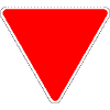
I haven't seen a driver's manual in years and plan to pick one up when my physical presence is required for license renewal later this year. I am curious about what information has changed and what information has been excluded over the years. I know back when the manual was still chiseled onto stone tablets it included the various sign shapes and colors and what those things stood for. Does anyone remember what the shapes are meant to convey? The greater number of sides on a sign the more important the message. The circular sign (infinite number of sides) is the most important as a car and train collision rarely ends well. Next is the STOP sign with eight sides,but the logic goes downhill from there,theoretically the YIELD sign should be a pentagon shape but that shape went to denote County Route markers,nor did YIELD make the cut for a rectangular shape but was assigned to a triangle. That seems to be a recurring theme with neat and orderly rules,they start out logical and easy to understand and slip slowly toward chaos...or maybe that is just me?


No comments:
Post a Comment