I'm not a big coffee drinker,a few cups in the morning and that's it for the day. With that said I rarely buy coffee out so I don't pay a lot of attention to all the different coffee stands that seem to be on every block,if not more than one per block. However I have wondered for a long time what the Starbucks logo was about and finally managed to hold that thought in mind long enough to find out.
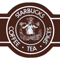
The original logo from 1971 was fashioned after a Norse woodcut,the image of a mythical two tailed mermaid siren. The siren's objective was to lure sailors with an enticing song to their demise amongst the rocks. The first logo was in brown and designed to resemble a cigar band. The mermaid represented the irresistible,seductive quality of the coffee. The logo since that time has undergone several changes. The first concealed the siren's breasts,the next rendition her navel had been removed. Shown below are the logos from 1971 to the present.


The original logo from 1971 was fashioned after a Norse woodcut,the image of a mythical two tailed mermaid siren. The siren's objective was to lure sailors with an enticing song to their demise amongst the rocks. The first logo was in brown and designed to resemble a cigar band. The mermaid represented the irresistible,seductive quality of the coffee. The logo since that time has undergone several changes. The first concealed the siren's breasts,the next rendition her navel had been removed. Shown below are the logos from 1971 to the present.


No comments:
Post a Comment